
Charting Your Budget in Excel – Visualise Your Progress with Graphs
This website may earn commissions from purchases made through links in this post. As an Amazon Associate, I earn from qualifying purchases.
If you are using Excel to keep a budget and want to add a graph but don’t know how, then this tutorial will show you how. Instructions are for Excel 2007, but all the options are available to create a chart under the Insert menu in previous versions.

I have been keeping my budget in excel for four years now. Previous to that, our budget was kept in a little exercise book. Just after we first bought our house, I decided to create some graphs. It was just for fun really (I know, I need to get out more!), but what I found really surprised me. The numbers that had been staring me in the face for years suddenly jumped up and had meaning. I could see our finances for the first time. And I realised for the first time just how much of our income was going towards our mortgage.
A sheet full of numbers is great, but for an instant idea of how your finances are, you can’t beat a graph. It condenses all those numbers down into a visual representation that has immediate meaning.
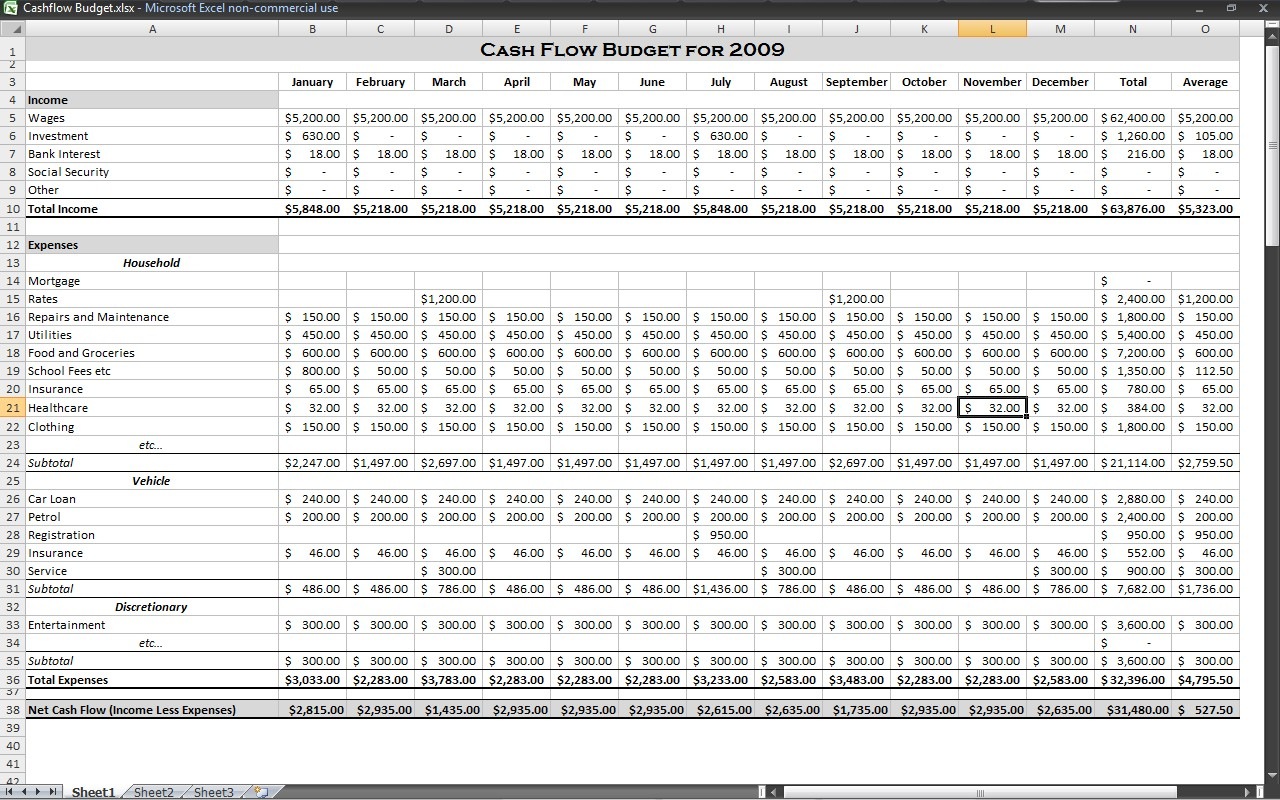
For this tutorial, I’ll be using the same budget spreadsheet as I used in the loan calculations tutorial. All figures are made up.
Disclaimer: This is general information only. In this blog, I share my savings and budget planning and what works for us, linking to authority websites where relevant. You should always consult a qualified financial expert when making money decisions to tailor plans to suit your circumstances.
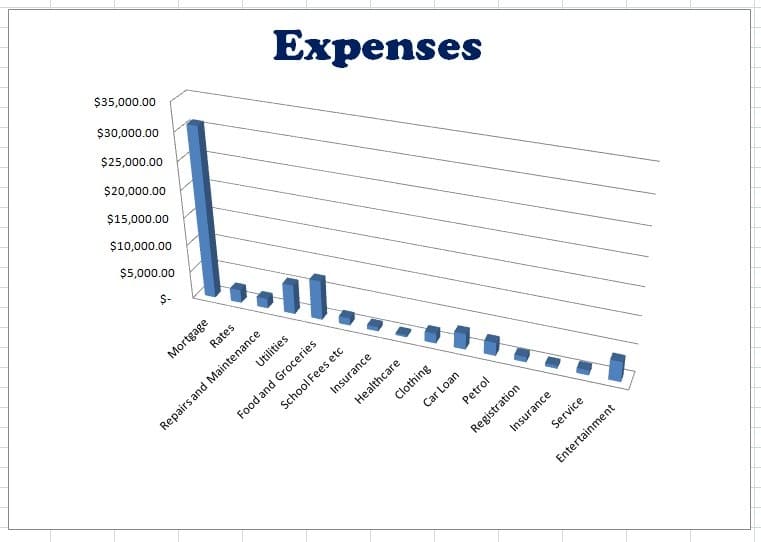
The first thing we’ll do is create a quick pie chart of our expenses.
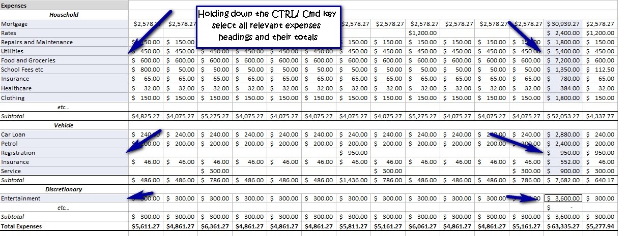
1. Holding down the CTRL / CMD(Mac) key on the keyboard select the expenses headings (skipping the subtotals and category headings) and the totals, also skipping the subtotals. All the relevant headings and their totals should be selected.
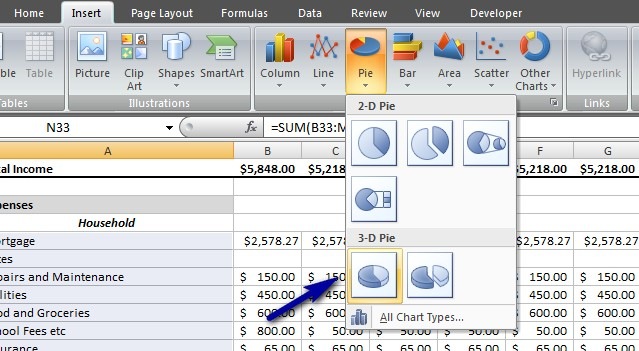
2. Go to the Insert ribbon and select a pie chart, I’ve chosen the 3D one. This will create a chart and place it right onto your data.
Actually that’s it for creating a chart. Graph done. Now we are going to format it a bit.
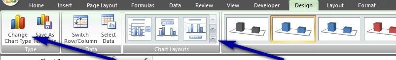
You will notice that Chart Tools has appeared at the top of the screen as a group of ribbons including Design, Layout and Format. We’ll be using these to format our chart. These options are available every time you click on a graph.
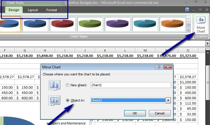
3. Click on the Design tab and then on the Move Chart option. Move your chart onto a new sheet by selecting object in: sheet 2, so that it is off your data. Once your chart is on the new sheet, grab one of the edges and move it around to where you want it. Grab a corner where the dots are to resize it.
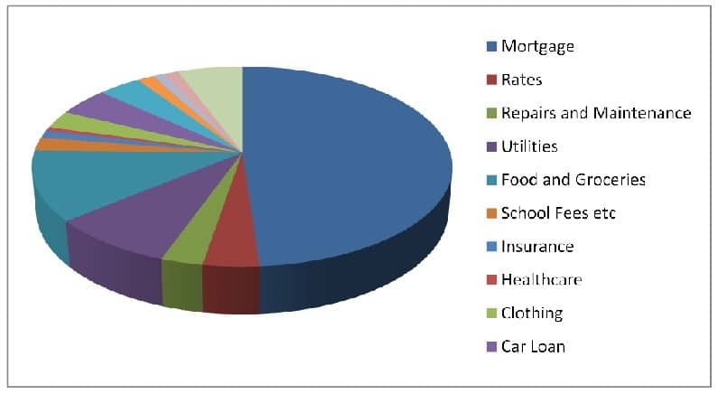
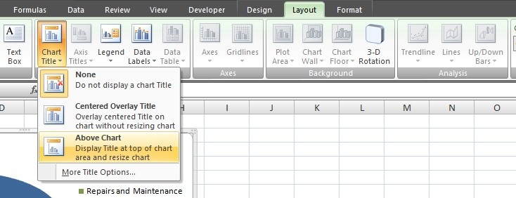
4. Click on the Layout tab and select Chart Title. Choose the Above Chart option. The words “chart title” will appear, highlight these and type in your title – I changed it to “Expenses”. You can format the title like any other text in Excel using the Home tab.
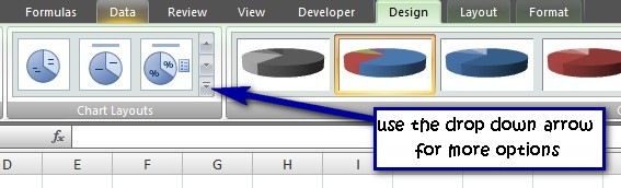
5. Back in the Design tab, choose a chart layout – I chose layout 6. If you hover over each of the option, the name will appear. This will put percentage labels on our chart.
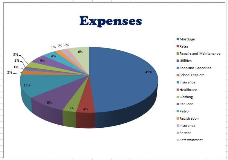
That’s it! We could have already seen from our budget, that the mortgage takes up a large chunk of our income, but now we have a visual representation, and can see the actual percentage of overall expenses that goes to the mortgage.
If you prefer to see the information in a column chart, then click on the chart to bring up the charting tools ribbons, click Design tab and select Change Chart Type. Choose a column graph and adjust the chart layout to suit. You can also go to the Layout tab, select Legend and turn it off.
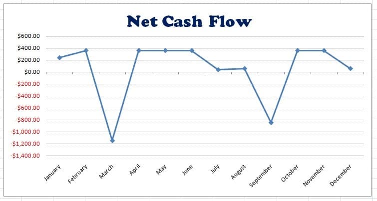
Finally, we’ll create a line graph showing net cash flow totals.
6. In our budget spreadsheet select the headings January to December at the top, and the net cash flow amounts for January to December, holding down the CTRL / CMD key.
7. Insert a Line Graph From the Insert tab.
8. Move the graph to the same sheet as the expenses graph and format it the same as we did for the pie graph (points 3 to 5). You may need to adjust where the month headings go by selecting axis: primary horizontal axis: more options under the Layout tab and changing the axis labels option to low.
You should have something that looks like this:
There are plenty of other charting options that I didn’t touch on here, have a play around to try out these option. Once you know the basics, you can chart any information that you like.
If you are comparing actual expenses with budgeted expenses, for example, you could use a column chart to make the comparison.
If you are saving for something specific, you could chart the target amount that you need to save and your actual savings to date. The great thing about Excel is that if you change your data in your spreadsheet, your chart will automatically update to show the current data. So every time you put money into your savings, your savings column will automatically rise towards your target.
If you have investments, then you could use a line graph to track your investment portfolio.
If you have irregular income, you could graph your income to see what months bring in the most income. You could compare this to what months you have the most expenses going out.
The sky is the limit.
If you enjoy the excel tutorials and find them useful, it would be great if you leave a comment. As these take a lot of time to write, it would be great to hear your feedback.


Thanks for taking the time, these are really useful tutorials!
Thanks for the info. I use YNAB and I want to visually keep tabs on recurring monthly expenses. I also want to track cashflow, especially upcoming cashflow for my business.
For future article productivity, I’d suggest adding a video using something like Camtasia. Also try voice-typing with something like the Voice Typing under Tools in Google Docs.
I’ve heard good things about YNAB. Thanks for your tip too :)
I love budgeting! I also spend a great deal of time reworking things and seeing how they apply.
I have recently switched how I track everything (I’ve moved a step beyond “my first budget” and getting more into a growth mindset).
I wanted to graph but had no idea where to start – this has been really helpful, thanks : )
Thank you for sharing your information.
Thanks for the tutorials. They are very clear and instructive.
Thank you
:)